


Iconography Dominates in the Age of the Attention Crash
 Young Urban Professional
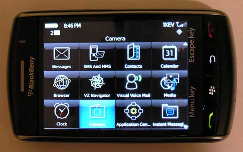
Blackberry Storm icons via the Gadgeteer
This idea didn't occur to me when I started and this blog five years ago and named it Micro Persuasion, but in all honesty it could have. It's been percolating in my subconscious for a long time. In the digital age - where every second there is something new tugging at our attention - we are influenced more than ever by tiny little icons. And there's no sign of the trend abating.
It used to be that in the old days only brands could afford nice logos. However, today almost everyone and everything has an icon. These little logos say a lot about a brand's persona and what they stand for. However, icons are not just for products and services anymore, it's for individuals too.
I don't know about you but I make decisions about the digital tools/services I use and the digital personas I choose to follow on Twitter or Friendfeed not just based on their attributes alone, but their icons. I bet that I am not alone. Icons also influence the mobile applications we choose to put on our handhelds, the sites we bookmark (because of their favicons) and the apps we run on our desktops.
For all of the conversation around personal branding and social media, there's not nearly enough attention paid to the art of iconography. With that here are some of my favorite icons and how they influence me...
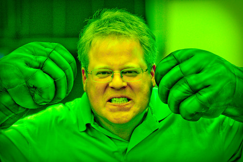
Scoble - I have been following Robert Scoble for years. However, ever since he became the Incredible Hulk on Friendfeed (thanks to Thomas Hawk) he cried out to be read even more closely. Unfortunately Scoble just changed his icon back to the old one but I wish he hadn't. In fact, he should take the Hulk icon leverage it everywhere!
Evernote - Evernote is one of those products I want to love. However, I am constantly picking it up and putting it down. However, every time I see the elephant icon in my dock or on my phone or look at the t-shirt that they sent me long ago (pictured below), I realize that Evernote has so much promise because, like an elephant, it never forgets. That keeps me coming back. (In fact, am composing this post with Evernote.)

Seesmic - Every time I look at this icon on my desktop it cries out to be clicked. There's no doubt that the icon is a draw, even though I find the desktop application to be slow. Still the cute icon encourages me to be patient that the service will be just as speedy as the cartoon.
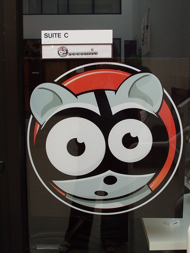
Seesmic Logo by Leah Jones on Flickr
What icons influence you? And how?
Reader Comments (12)
Also I'm with you - I dig the Seesmic icon alot. They took a chance on doing it like that but I think it payed off.
I like ambigrams, it's mindbending to think how they were made in both (or more) directions.
And I treasure my own logo, wasn't hard to come up with it; it's easy to remember. When you see pink and green and smell watermelons, think of me!
I have been able to discern some patterns:Icons and logos that are green, highly contrasted, and imply motion -- say, an arrow or ripples -- always get clicked.Icons with human faces are appealing, whether realistic or cartoon-ish.Icons with letters are avoided.
Some of her perspective can probably be captured by visiting a foreign-language web site, and exploring.
It's really working well when developers can roll them out without words accompanying them - and see the users still have an exceptionally high success rate the first time out.
It's not dissimilar to word choices for links and nav on Web sites of the past (and, unfortunately, the present) that were highly creative, but too vague to make sense to users.
Iconography and other back of the napkin visual thinking looks to be big in a globalized world that needs a universal language.